Walberg Works
♬ Let's find a rhythm and create something! ♫
“Bitter Past”
Disciplines: Brand Design, Graphic Design, Research
Duration: 48 hours
Tools: Photoshop
My Grandpa used to have a bar…
so I updated it into a cocktail bitters business.
Let’s look at the product and then examine the distilling process.
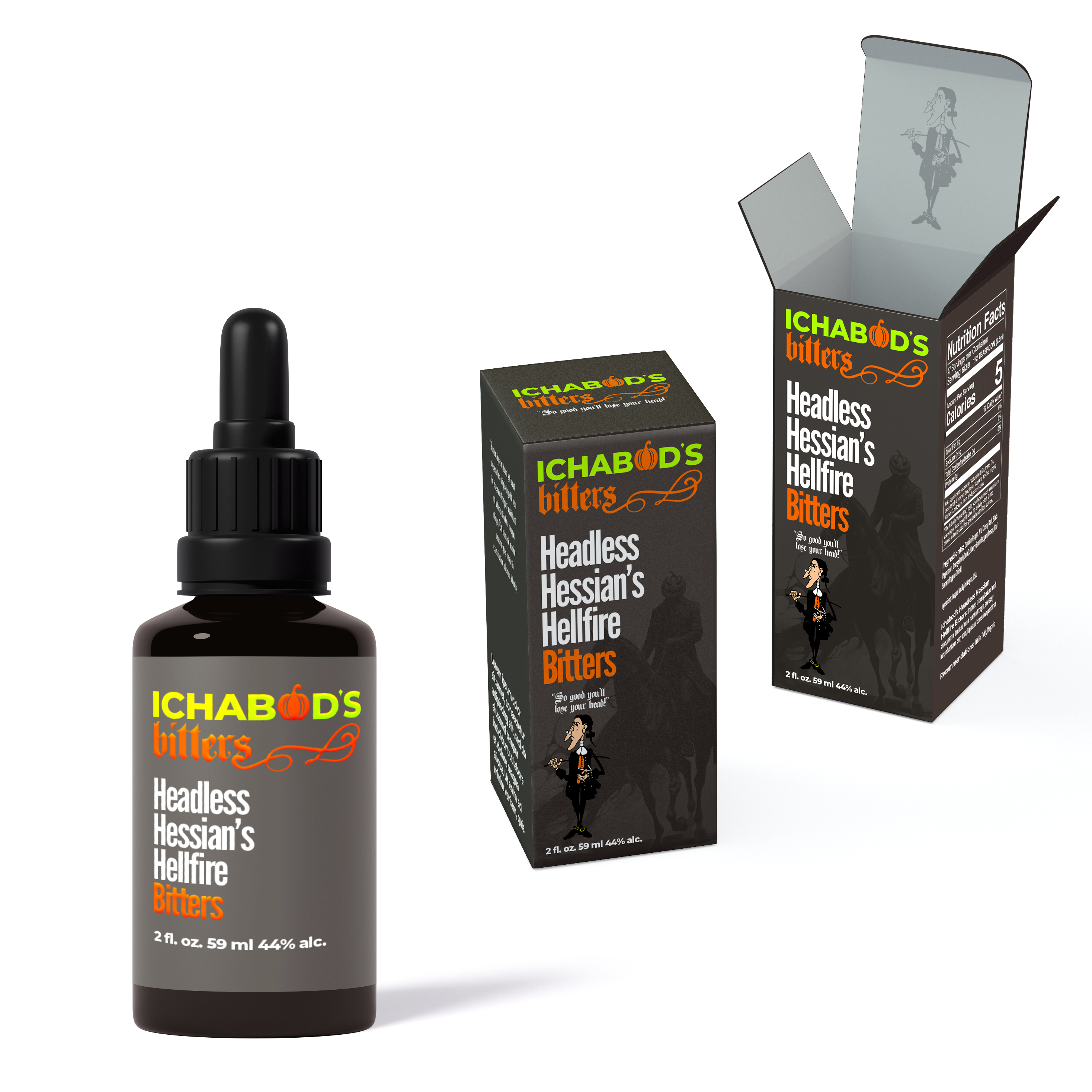
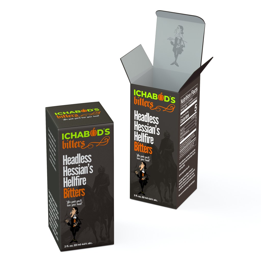
↘ Results: Ichabod’s Bitters
↘ Problem: Spirits
I didn’t get a chance to spend much time with my grandfather so my knowledge of him exists mainly through stories. One in particular always fascinated me: his bar. Unfortunately, I never got to see it or talk to him about it.
So I decided to revive his bygone business to learn more about it.
↘ Research: Class Is In Session
Split Pea Soup & Cheese
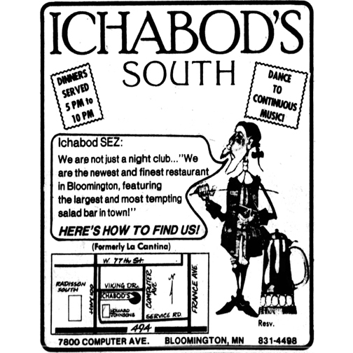
In 1972 Charles Patrick Howard opened Ichabod’s in downtown Minneapolis Minnesota. Known for stiff drinks and split pea soup, it remained a staple for almost a decade until it closed. I discovered his original logo was illustrated by G.R. Cheesbrough, a local artist.
Ghost Stories
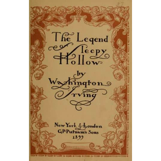
The namesake of the bar comes from the protagonist in Washington Irving’s short story “The Legend of Sleepy Hollow”, Ichabod Crane.
Adding some spookiness to the design to pay homage, specifically utilizing popular pumpkin imagery, was a goal.
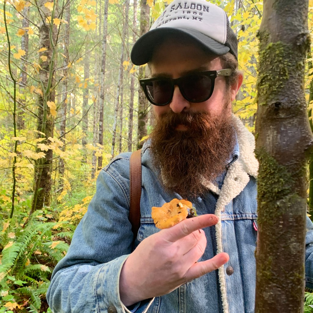
Fungus Among Us
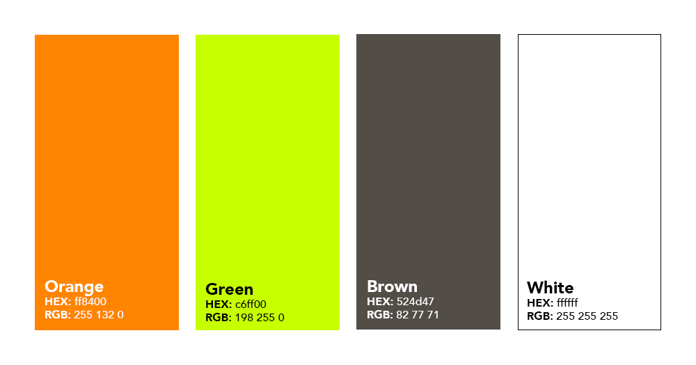
A benefit to living in the Pacific Northwest is the abundance of opportunities to forage food and ingredients. I wanted to incorporate that experience through use of colors: browns are a favorite of mine to design with.
↯ Takeaways: Design Elements
- G.R. Cheesbrough illustration of Ichabod Crane
- Pumpkin
- Foraging color palette: Greens, Browns
↘ Drafts: Off With His Head
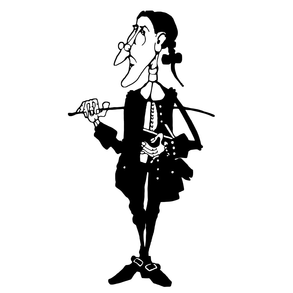
↑ My initial draft of Ichabod went well and in my opinion captured Chees-brough’s initial concept. His original silhouette was fantastic which I wanted to hold true.
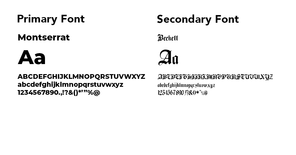
↑ Due to Ichabod’s skinny and odd shape I opted for left-aligned text in hopes to nestle it in left of his head. I also wanted a stylized gothic text for “bitters”.

↑ The Headless Horseman was a blast to work on. I wanted some juxtaposition from the cartoon Ichabod so went with a more realistic illustration.
↯ Takeaways: Lessons Learned
- Ichabod’s odd shape might prove difficult with packaging and placement.
- Text needs another element to fill out negative space.
- Headless Horseman might be better suited more transparent as a background feature.
↘ Revisions: Carving The Pumpkin
← I liked the direction Ichabod was heading so I didn’t need to edit much. Tried using the “Ghoulish Green” seen below to minimize colors used but it looked odd so opted for yellow buttons and buckles. Also looked too close to the flag of Ireland.
Color Palette:

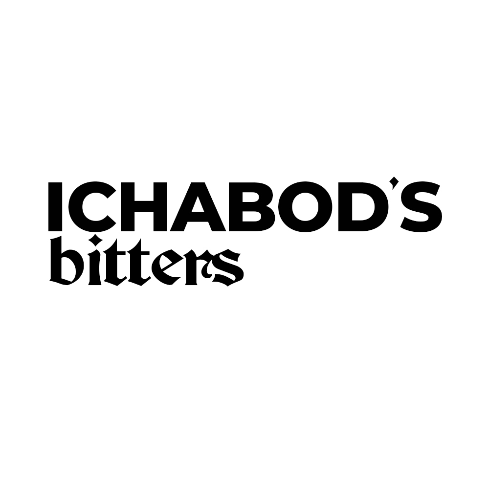
← Added a flourish extending from the “s” to fill out the negative space below “Ichabod’s”. A flat vector pumpkin seemed to fit perfect as an “O” and connected the spooky elements without going too Halloween-ish. Wanted it to read more fall colors.
Changed the font for “bitters” to a more exaggerated but still legible gothic font.
“So good you’ll lose your head!” came to me as a slogan tying in more themes from the “Sleepy Hollow” short story.
Typeface:
Color Palette:
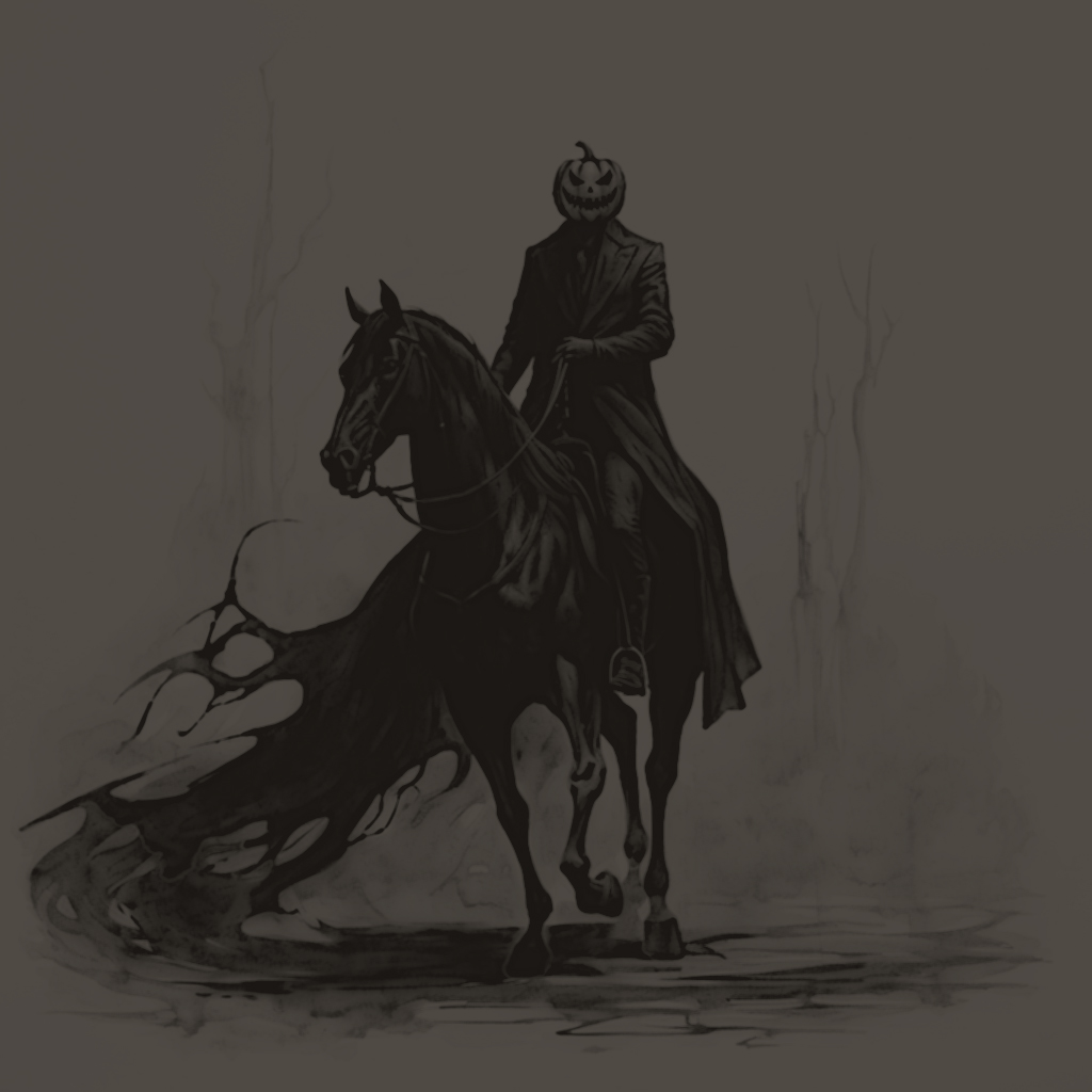
← Making the Headless Horseman more transparent worked! Now more brooding from the depths than bold and distracting. I added a little bit of scenery to him to again separate the design from the cartoonish Ichabod.
↯ Takeaways: Final Checklist
✓ Typography
✓ Color Palette
✓ Visual Elements
✓ Theme
↘ Solution: Back In Business
Product Packaging:
Product Bottle:

“Ichabod” Brand Character (Color):
Primary Logo Lock-up (Color):

Color Palette:

Primary Logo Lock-up (Black & White):

Logo Guidelines:
↘ Conclusion: Bittersweet
Although I missed out on sharing this with my grandfather it did give me a glimpse into what his process might have been like back in the 70’s working with a local designer on his branding. It was a great learning process designing with set parameters and little to start with. Challenging and rewarding! I have even made plans to dive into making bitters utilizing this brand and hope to bottle it soon. Cheers!
– Topher
